
Contrary to the belief that digital design is a new frontier, its core principles are a direct philosophical inheritance from a century ago. The minimalist aesthetic, grid systems, and functional typography you use daily are not modern inventions but a digital translation of revolutionary ideas from movements like Bauhaus and the Swiss Style. This article reveals this invisible blueprint, showing how decisions made by artists in the 1920s continue to dictate the visual grammar of our screens today.
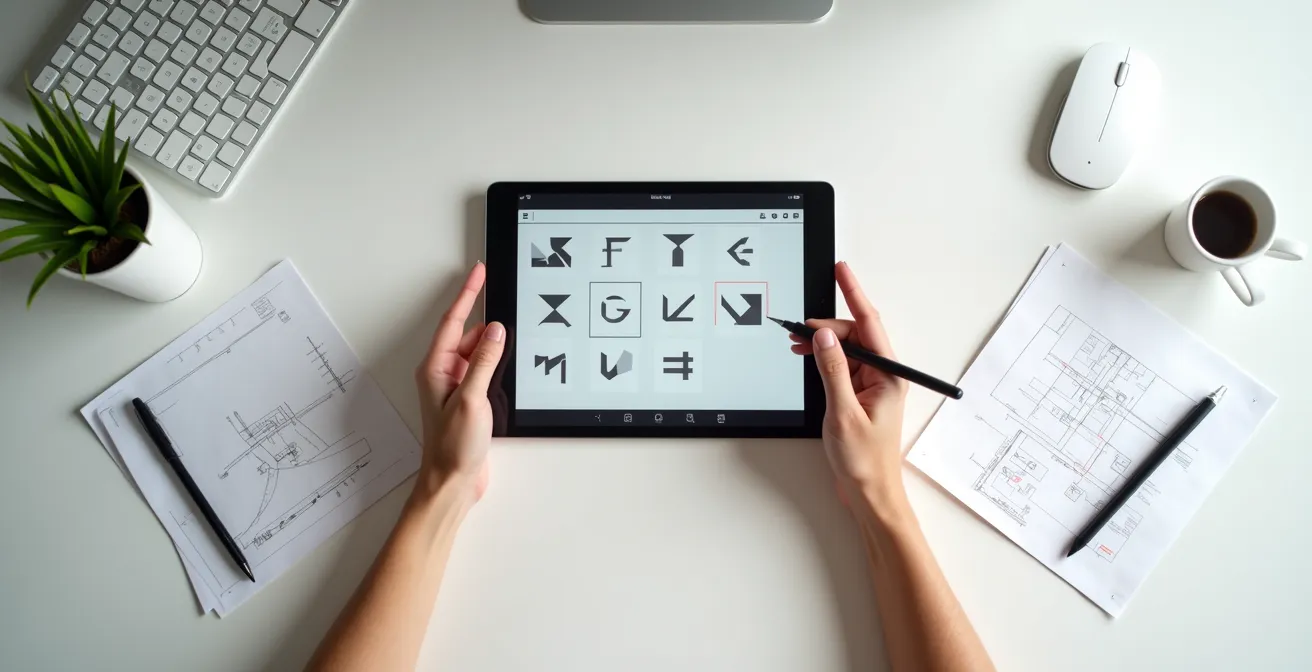
As a UX/UI designer, your day is a series of seemingly modern decisions. Should this button be red or blue? Does this text need a serif or sans-serif font? How do you align elements to create a clean, intuitive layout? We are told to prioritize user-friendliness, to strive for clarity, and to embrace minimalism. These feel like contemporary best practices, born from the digital age and data-driven A/B testing.
But what if these choices are not truly yours? What if the “rules” of good design were written long before the first pixel was ever illuminated? The truth is, the fundamental visual grammar of every app, website, and digital interface is a direct legacy of artistic revolutions from the early 20th century. The quest for order, the function-over-form philosophy, and the very way we guide a user’s eye across a screen are not new problems. They are old solutions, translated from print to pixel.
This exploration is not merely academic. Understanding this design DNA—this invisible blueprint from the past—is the key to moving from a designer who simply follows rules to one who understands the deep-seated cultural and psychological power behind them. We will trace this lineage, connecting the dots from the avant-garde workshops of 1920s Germany to the Figma file on your desktop, revealing how history has already made most of your design decisions for you.
To navigate this historical journey, this article breaks down the key principles and their origins. The following sections will guide you through the foundational concepts that shaped—and continue to shape—the world of digital design.
Summary: Why Your Modern App Interface Still Follows Rules Set in the 1920s
- Order out of Chaos: How the Swiss Grid Defined the Internet
- Red for Danger or Hunger: Contextualizing Color in Design
- Serif vs. Sans: The Battle for Readability on Mobile
- Nostalgia as a Tool: Why 90s Design Is Back in Vogue
- Dark Patterns: When Good Design Deceives the User
- Cropping and Asymmetry: How Imports Changed European Framing
- Cleaning Up the Mess: Why Straight Lines Replaced Curves
- How to Read a Painting Like a Novel from Left to Right
Order out of Chaos: How the Swiss Grid Defined the Internet
Every time you open design software and enable a layout grid, you are summoning the ghost of the International Typographic Style, more commonly known as the Swiss Style. Emerging in the 1950s as a successor to Bauhaus principles, this movement was obsessed with order, objectivity, and clarity. Its proponents believed that design should be a socially useful and rational activity, free from the whims of artistic expression. The grid was its most powerful tool for achieving this—a rigid framework to bring structure to the chaos of information.
This concept was revolutionary because it treated the page not as a blank canvas for decoration, but as a structured space for communication. As design pioneer Josef Müller-Brockmann stated, “The modular grid is considered the basis of the Swiss style and a key element of modern graphic design.” This philosophy was a perfect match for the early internet, a text-heavy medium that desperately needed a system for organizing content in a logical, scalable way. The grid provided the invisible scaffolding for web pages, defining columns, gutters, and alignment long before CSS frameworks made it easy.
Today, this philosophical inheritance is embedded in every digital product. From the card-based layouts of Pinterest to the strict column systems of news websites, the grid is the unspoken rule. Grid systems are now an established tool used by print and web designers to create balanced, legible, and predictable user experiences. They are the primary reason why, despite the infinite flexibility of the digital canvas, so much of the web looks and feels structured in a familiar way. It’s the triumph of rationalism over randomness, a principle born on paper that now dictates the order of our pixels.
Red for Danger or Hunger: Contextualizing Color in Design
Color in UI design is never neutral. A red notification badge provokes urgency, while a green success message provides relief. This strategic use of color to guide behavior feels like a modern UX discovery, but its roots lie in the psychological experiments of the Bauhaus school. Artists like Wassily Kandinsky and Josef Albers moved beyond treating color as mere decoration and began a systematic investigation into its emotional and psychological impact. They explored how colors interact, advance or recede, and evoke specific feelings in the viewer.
As noted in “The Bauhaus Legacy: Shaping Modern UX Design,” the strategic use of color is not just aesthetic but is employed to evoke certain emotions, draw attention, and guide user behavior. This is the design DNA at work in every interface. The choice of red for an error message isn’t arbitrary; it leverages a deeply ingrained cultural association with danger and warning. Similarly, food delivery apps frequently use reds and oranges not just for branding, but to tap into primal connections between these colors and feelings of hunger and energy.
Case Study: Apple’s Monochrome Design Philosophy
A prime example of Swiss influence is seen in Apple’s software design. The company largely avoids loud visual noise, embodying the principle of ‘form follows function’. According to an analysis on Swiss Style’s influence, UI elements in iOS and macOS are subtle and understated, often monochrome, which helps users focus entirely on their content. This isn’t just minimalism for its own sake; it’s a deliberate choice rooted in the belief that design should clarify, not distract. The interface recedes, allowing the user’s photos, messages, and work to become the primary visual experience.
Understanding this historical context elevates a designer’s work. You are no longer just “picking colors” but wielding a powerful, non-verbal language. You must consider not only the aesthetic harmony but also the cultural context and the learned, psychological responses a color will trigger. The goal, inherited from the early modernists, is to create a visual grammar that the user understands instantly, without conscious thought.
Serif vs. Sans: The Battle for Readability on Mobile
The debate between serif and sans-serif fonts is a cornerstone of digital typography, but it’s a battle that began a century ago. Serif fonts, with their small decorative strokes, have roots in Roman stonework and have long been the standard for printed books, as the serifs guide the eye along lines of text. However, the rise of modernism in the early 20th century brought a radical shift. Bauhaus and Swiss Style designers saw serifs as ornate, unnecessary decoration—a violation of the “form follows function” mantra. They championed sans-serif typefaces like Helvetica and Futura for their clean, geometric, and objective feel.
This ideological preference found a practical justification with the advent of low-resolution computer screens. The intricate details of serifs rendered poorly on early displays, appearing blurry and cluttered. Sans-serif fonts, with their uniform stroke weights and simple forms, were far more legible. This technical limitation cemented the dominance of sans-serif in the digital world. An analysis of design trends confirms that minimalist, legible, and geometric fonts are commonly used in modern UI, a direct legacy of this modernist preference combined with early technological constraints.
Even as screen resolutions have improved to the point where serifs can be rendered beautifully, the sans-serif-as-default mindset persists. It has become part of our collective expectation for what a “modern” or “tech” interface should look like. As one design analysis puts it, modern digital typography is treated functionally, with “a clear hierarchy featuring bold headlines and light body text, with no decorative or expressive fonts.” This is the Swiss Style doctrine in action. While serif fonts are making a comeback in digital branding to evoke a sense of tradition or elegance, the functional core of most apps—buttons, menus, and body copy—remains firmly in the sans-serif camp, a choice dictated by historical philosophy as much as modern readability studies.
Nostalgia as a Tool: Why 90s Design Is Back in Vogue
Design history doesn’t just move forward; it also circles back on itself. The recent resurgence of 90s and Y2K aesthetics in UI design is a perfect example of nostalgia being used as a deliberate tool. Characterized by chunky fonts, pixel art, neon colors, and sometimes-chaotic layouts, this trend is a conscious rejection of the clean, sanitized minimalism that has dominated the last decade. It taps into a collective memory of the early, wilder days of the internet—a time of exploration and personal expression before corporate templates took over.
This isn’t just about making things look “retro.” It’s about evoking the feeling associated with that era: authenticity, fun, and a certain anti-establishment creativity. For users who grew up in the 90s, these visual cues trigger a sense of comfort and familiarity. For younger generations, it represents a vintage cool, a glimpse into a digital world that felt more human and less polished. This trend is a form of cultural shorthand, using a shared visual past to create an immediate emotional connection with the user.

Case Study: Cyberpunk and Retro-Futurism in Modern UI
The cyberpunk aesthetic, which peaked in the 80s and 90s, is a key influence on today’s retro-futurist UIs. As noted by a DesignerUp trend analysis, this style is making a comeback with a modern twist. Today’s cyberpunk-inspired interfaces use neon colors, glitch effects, and futuristic typography, but within a cleaner, more minimal framework than their predecessors. It’s a “clean-retro” look that borrows the rebellious energy of the past while adhering to modern standards of usability, creating a feeling that is both futuristic and nostalgic at the same time.
For a UX/UI designer, this trend demonstrates that the historical “rules” are also made to be broken—or at least, remixed. Understanding the design history of different decades allows you to pick and choose elements not just for their aesthetic value, but for the specific emotional resonance they carry. It turns history into a palette of moods and feelings to be deployed strategically.
Dark Patterns: When Good Design Deceives the User
The foundational principle of modernism, inherited from the Bauhaus, is “form follows function.” It’s an ethical as well as an aesthetic stance: every element should serve a clear and honest purpose. In a well-designed interface, this translates to clear navigation, an understandable hierarchy, and user-friendly interactions that help people achieve their goals. A recent analysis highlights that despite being over a century old, Bauhaus continues to impact UI and UX by promoting this fundamental clarity.
Form follows function – each visual element should have a purpose. In contemporary terms, this translates to having a clear hierarchy, easy visual navigation, and user-friendly interfaces.
– SandCup Design, Less is More: Bauhaus Design’s Powerful Influence on Modern UX
However, this noble principle can be twisted. “Dark patterns” are user interfaces intentionally designed to deceive users into doing things they might not want to do, such as signing up for a recurring subscription or sharing more personal data than intended. These patterns exploit a user’s understanding of standard design conventions. A button’s color and placement, the size of a font, or the wording of a choice are all manipulated. Here, form actively betrays function. The design *looks* like it’s helping the user, but its true function is to serve the business’s interests at the user’s expense.
Understanding the history of “good” design is crucial to identifying “bad” design. Dark patterns are effective precisely because they subvert the consistent visual grammar established by movements like Bauhaus and the Swiss Style. Users have been trained for decades to expect that a large, brightly colored button is the primary, recommended action. A dark pattern might use this convention to trick a user into agreeing to unfavorable terms. Recognizing this ethical inversion is a critical skill for the modern designer, who must act as a guardian of the user’s trust and a defender of the original, user-centric promise of modern design.
Cropping and Asymmetry: How Imports Changed European Framing
For centuries, Western art was dominated by symmetry and centered compositions, creating a sense of stability and balance. This changed dramatically in the 19th century with the arrival of Japanese woodblock prints (Ukiyo-e) in Europe. Artists like Degas and Van Gogh were captivated by their radical approach to framing: subjects were often cropped unconventionally, placed off-center, and balanced by large areas of empty space. This was the birth of modern asymmetry in Western visual culture, a direct import from the East.
This new way of seeing was fully embraced by the modernists who followed. Swiss Style designers, in particular, saw asymmetry as a tool for creating dynamic, engaging layouts. As one analysis notes, “Swiss Design often employs asymmetry, using large amounts of whitespace to balance the layout and create dynamic compositions.” This wasn’t about chaos; it was about achieving a more complex and active form of balance. Instead of a static, centered object, the viewer’s eye is guided across the page from one point of interest to another, a journey directed by the designer.
This principle is a cornerstone of contemporary UI design. Think of a modern webpage: the logo is in the top left, the main headline is often off-center, and a large “hero” image might bleed off the edge of the screen. This is a direct digital translation of the compositional rules imported from Japan over 150 years ago.
Action Plan: Auditing Your UI’s Visual Grammar
- Identify the Grid: Examine your layout. Is the grid rigid and uniform, or is it intentionally broken? Justify why this structure best serves the content and user goal.
- Analyze Hierarchy: Track the natural path your eye follows. What do you see first, second, and third? Does this path align with the most critical information or actions?
- Justify Color Choices: List your primary and secondary colors. Are they purely aesthetic, or do they serve a functional purpose (e.g., indicating status, creating an emotional tone) based on learned cultural cues?
- Scrutinize Typography: Does your font choice primarily serve readability, or is it meant to evoke a specific aesthetic (e.g., modern, traditional)? Is this choice consistent with your brand’s message?
- Evaluate Composition: Look for asymmetry and whitespace. Are they used intentionally to create visual tension, guide focus toward a call-to-action, or simply to give content breathing room?
The “Rule of Thirds” in photography, now built into our smartphone cameras, is another manifestation of this preference for asymmetry. By training users to create and prefer off-center compositions, technology reinforces a visual grammar that has its roots in a cross-cultural artistic exchange.
Cleaning Up the Mess: Why Straight Lines Replaced Curves
Before modernism, decorative arts were dominated by the flowing, organic curves of movements like Art Nouveau. It was a style that celebrated nature, craftsmanship, and ornate detail. The industrial revolution, however, brought with it a new reality: mass production. The intricate, handcrafted curves of the past were inefficient and expensive to replicate with machines. This economic and technological shift created a fertile ground for a new aesthetic—one that celebrated the machine, not nature.
The Bauhaus school seized on this, championing a visual language of pure geometry: circles, squares, and triangles. These were not just aesthetic choices; they were a rational response to the new age of industrial manufacturing. Straight lines and simple geometric shapes were easy to standardize, reproduce, and assemble. This was the ultimate expression of “form follows function,” where the function was now industrial efficiency. It was a deliberate “cleaning up” of the perceived messiness and decadence of previous styles.
This preference for geometric purity is fundamental to digital design. Pixels themselves are squares, forming a natural grid that lends itself to straight lines and rectangular forms. Our UIs are built from these basic blocks: rectangular buttons, square icons, and circular user avatars. Even when we create rounded corners on a button, we are simply softening a fundamentally rectangular element. UI design trend analysis confirms that the Bauhaus style, revolving around geometric graphics like semicircles, circles, and rectangles, remains a dominant force. This is not because designers lack imagination, but because the very medium they work in—the screen—is inherently geometric. The digital world is a built environment, and its native language is the straight line and the perfect circle.
Key Takeaways
- Grids, minimalism, and sans-serif fonts are not recent trends; they are a direct philosophical inheritance from the Bauhaus and Swiss Style movements of the 20th century.
- The way users scan screens (e.g., the F-Pattern) is rooted in centuries-old Western reading habits, forcing digital design to conform to ancient patterns of consumption.
- Every “modern” design choice—from color psychology to asymmetrical layouts—carries deep historical and cultural weight that subconsciously influences user perception and behavior.
How to Read a Painting Like a Novel from Left to Right
In Western cultures, we read from left to right, top to bottom. This deeply ingrained habit, learned from childhood, dictates more than just how we read text; it dictates how we consume all visual information. Renaissance painters understood this intuitively, often placing the start of a narrative on the left of the canvas and its conclusion on the right. The eye naturally begins its journey in the top-left and scans across, following a predictable path. This is a foundational principle of path dependency in visual consumption.
This ancient scanning behavior persists, unchanged, on the digital screen. Eye-tracking studies have famously revealed that users scan websites in an “F-shaped pattern.” They read the top headline (the top bar of the F), then scan down the left side of the page looking for keywords or points of interest, occasionally darting out to read a subheading or a bolded phrase (the shorter bar of the F). As an analysis from Smashing Magazine points out, this knowledge allows modern designers to place critical elements along these natural scanning paths, ensuring they get noticed.
This is why logos are almost always in the top-left corner and why main navigation menus run horizontally across the top or vertically down the left side. It’s not a coincidence; it’s a deliberate concession to a centuries-old reading habit. The concept of visual hierarchy—organizing content so the viewer knows what to look at first, second, and third—is a digital translation of this principle. By using size, color, and placement, designers create a guided tour through the information, following the predictable path the user’s eye will take anyway. You are, in effect, teaching the user how to read your interface like a page in a book they’ve been reading their whole life.
By tracing the design DNA from Bauhaus geometry to Swiss grids and left-to-right reading patterns, it becomes clear that we are not the first to solve these problems. We are simply adapting a century of tested visual philosophy to a new medium. The next time you align an element to a grid or choose a sans-serif font for its clarity, know that you are part of a long historical tradition. The most effective step a designer can take is to make these choices not by habit, but with a conscious understanding of the powerful history they represent, turning inherited rules into intentional, impactful design.