
In summary:
- Treat a painting not as a single image, but as a directed narrative with a beginning, middle, and end.
- Artists use a “visual syntax” of light, gaze, and composition to control where you look and in what order.
- Decoding symbols requires understanding their context within the painting, not just their universal meaning.
- Recognizing techniques for showing time and movement is key to unlocking the story unfolding on the canvas.
Have you ever stood before a grand, complex painting in a museum and felt a nagging sense that you were missing something? You see the figures, the landscape, the objects, but the “story” remains elusive, locked behind a visual code you can’t decipher. Many guides suggest you simply “look at the composition” or “learn the symbolism,” but this often feels like a disconnected checklist rather than a true method for understanding.
The common approach treats a painting as a static, decorative object. But what if the real secret was to stop *looking* and start *reading*? The most compelling masterpieces are not snapshots; they are meticulously constructed narratives, designed by the artist to be experienced in a specific sequence, much like the chapters of a novel. The artist is a director, using a deliberate visual syntax to guide your eye and your mind through a story.
This guide abandons the static checklist in favor of a dynamic method. We will explore the grammar of visual storytelling—how artists manipulate light to create a “reading order,” how the gaze of figures builds a web of social drama, and how even a still canvas can depict the passage of time. By learning to recognize this syntax, you can move from a passive viewer to an active reader, capable of unlocking the rich narratives hidden in plain sight.
For those who prefer a hands-on approach to visual learning, the following video offers a primer on formal analysis, a core skill for deconstructing how artists compose their work. It serves as an excellent practical complement to the narrative decoding techniques we will explore.
To help you navigate this journey into visual literacy, this article is structured to build your skills progressively. We will begin by understanding how your attention is controlled, then move to decoding time, social dynamics, and symbolism, before revealing how artists can even become unreliable narrators. The following summary outlines the key stages of our exploration.
Summary: How to Read a Painting: A Guide to Decoding Its Hidden Narrative
- Why Your Eye Always Lands on the Same Spot in a Masterpiece
- Three Times the Same Figure: Decoding Multiple Scenes in One Frame
- Who Is Looking at Whom: Mapping Social Dynamics in Group Portraits
- Why is There a Skull? decoding the Memento Mori
- Fact or Metaphor: Knowing When Art Is Lying to You
- Why Seeing Art in Person Changes Your Brain Chemistry
- Painting Time: How to Show Movement on a Static Canvas
- Saying “I Love You” with a Fern: Victorian Botanical Codes
Why Your Eye Always Lands on the Same Spot in a Masterpiece
The first step in reading a painting is recognizing that you are not in complete control of your own gaze. Artists are masters of psychological direction, using a technique called visual hierarchy to create a deliberate path for your eye. They don’t just fill a canvas; they orchestrate your attention, ensuring you see element A, then B, then C, in precisely the order that serves the narrative. This is not accidental; it is a fundamental part of the visual syntax.
Think of it as a spotlight on a stage. The artist decides which character or object gets the light first, establishing the story’s protagonist or opening scene. Baroque masters were particularly skilled at this. In the works of Caravaggio, for example, the dramatic use of light and shadow (chiaroscuro) does more than create mood. As one analysis of his work explains, light actively guides viewers through the narrative, revealing story elements in a specific sequence through controlled contrast and selective illumination. A bright face emerging from darkness isn’t just illuminated; it’s the first word of a sentence you are being invited to read.
To begin seeing this directorial hand at work, you must learn to identify the tools artists use to manipulate your focus. This isn’t about subjective preference; it’s about recognizing objective visual cues designed to capture and guide your attention. The following checklist provides a framework for deconstructing this visual hierarchy in any painting you encounter.
Your Action Plan: Identifying the Tools of Visual Hierarchy
- Identify the primary focal point: Look for the area with the highest contrast. This is often where the lightest light meets the darkest dark. That’s your starting point.
- Trace secondary focal points: Scan for the most saturated or vibrant colors on the canvas. These often mark the next ‘stops’ on your visual journey.
- Follow directional lines: Look for explicit lines (roads, arms, spears) and implicit lines (the gazes of figures, the direction of a gesture) that lead your eye from one point to another.
- Map value patterns: Notice how the artist uses gradients of light and shadow to create a path, often leading you from a bright foreground into a darker, more mysterious background.
- Observe texture density: In some paintings, areas with more detailed or complex texture will draw the eye more than smoother, simpler areas.
Three Times the Same Figure: Decoding Multiple Scenes in One Frame
Once you understand how artists guide your eye, the next revelation is that a painting doesn’t have to obey a single moment in time. While we think of a painting as a “snapshot,” many historical works function more like a comic strip or a film sequence, compressing multiple moments of a story into a single frame. This is known as continuous narrative, a key piece of visual syntax for telling stories that unfold over time.
This technique is most obvious when you see the same figure appear multiple times within the same image, performing different actions. The artist is showing you a temporal progression: the character was here, then did this, then ended up over there. Your eye, guided by the composition, reads this sequence and reconstructs the timeline of the story. This breaks the illusion of a single, frozen instant and transforms the canvas into a dynamic, time-based medium.
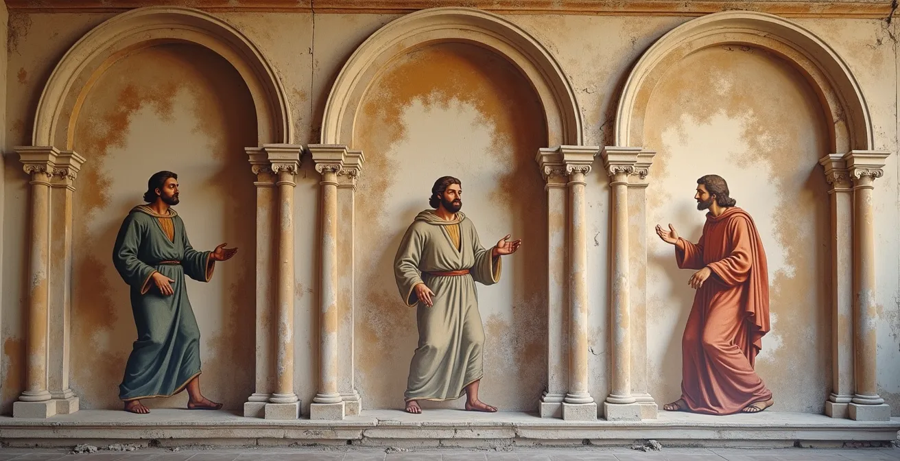
As the artwork above illustrates, the repeated figure creates a clear timeline across the composition. This is distinct from other narrative forms, such as monoscenic art, which captures a single, unified moment, or synoptic art, which jumbles different moments together without a clear reading order. Recognizing which narrative mode the artist is using is crucial to correctly interpreting the story.
The following table, based on formal art historical classifications, breaks down these different strategies. Understanding them allows you to identify precisely how an artist is choosing to manipulate time within the frame.
| Narrative Type | Definition | Visual Strategy | Example Period |
|---|---|---|---|
| Monoscenic | Single moment frozen in time | One unified action | Classical Greek art |
| Synoptic | Multiple moments without clear timeline | Scattered temporal elements | Medieval manuscripts |
| Continuous Narrative | Figure repeated to show time flow | Sequential appearances of same figure | Renaissance frescoes |
Who Is Looking at Whom: Mapping Social Dynamics in Group Portraits
Beyond composition and time, one of the most powerful narrative tools in an artist’s arsenal is gaze. Where a figure looks—or pointedly doesn’t look—is never an accident. In group portraits and complex scenes, the network of sightlines creates an invisible architecture of emotion, power, and social connection. Learning to map these gazes is like eavesdropping on the silent conversations happening within the painting.
There are three primary types of gaze to identify. First is the intra-diegetic gaze, where figures look at each other within the world of the painting. This reveals relationships: who is allied with whom, who is in conflict, who is subordinate. Second is the extra-diegetic gaze, where a figure breaks the fourth wall and looks directly out at you, the viewer. This creates a powerful, intimate, or sometimes unsettling connection, making you a participant in the scene. Finally, there’s the averted gaze, where a figure looks away from the action or out of the frame, suggesting distraction, shame, or a hidden internal life.
Mapping these sightlines can reveal the entire social drama. Where do the gazes converge? Often, it’s on the most powerful or important person in the room. Who is being ignored? Their isolation is a key part of the story. This isn’t just an artistic theory; it’s a measurable psychological phenomenon. As a comprehensive eye-tracking study on depictions of the Last Supper revealed, the arrangement of gazes is fundamental to how we process the narrative.
This scientific finding confirms what art historians have long argued, as summarized by the study’s authors, Rosa Sancarlo, Zoya Dare, and Raphael Rosenberg:
Gaze direction creates internal vectors of power, intimacy, or conflict within the painting’s narrative structure.
– Rosa Sancarlo, Zoya Dare, and Raphael Rosenberg, Eye-tracking study on Last Supper paintings
By treating gazes as active vectors, you transform a static group of people into a dynamic network of relationships. You are no longer just seeing faces; you are reading a social map, uncovering hidden alliances, secret tensions, and the unspoken hierarchies that define the scene.
Why is There a Skull? decoding the Memento Mori
Perhaps no element of art is more misunderstood than symbolism. Many people approach it with a “dictionary” mindset: a skull means death, a dove means peace. While not entirely wrong, this approach misses the most important rule of visual syntax: a symbol’s meaning is defined by its context. A skull in a 17th-century Dutch still life tells a very different story from a skull at the foot of the cross. To read a painting correctly, you must learn to spot these crucial context-shifts.
This is most apparent in the tradition of *Vanitas* and *Memento Mori* paintings, which are filled with objects meant to remind the viewer of life’s fragility and the vanity of earthly pursuits. In this context, a skull, a snuffed-out candle, or wilting flowers all point to the inevitability of death and the fleeting nature of beauty and pleasure. However, the same symbol can be repurposed to tell a different story in another genre.
Case Study: The Shifting Meaning of the Skull in Dutch Golden Age Art
In 17th-century Dutch Calvinist paintings, the skull’s narrative function changes dramatically with its surroundings. Within a *Vanitas* still life, surrounded by books, instruments, and riches, it serves as a stark warning against placing value in worldly knowledge and material possessions. However, when placed at the foot of a Crucifixion scene, the same skull represents Adam’s skull, found at Golgotha (the “place of the skull”). Here, its meaning is transformed: it symbolizes humanity’s fall from grace and ultimate redemption through Christ’s sacrifice. In a scholar’s portrait, it can signify deep contemplation of mortality as the path to true wisdom. The symbol is the same, but the story it tells is entirely different.
This principle of context-dependent meaning applies to a wide range of symbols. The table below, drawing on information from museum guides like those of the National Gallery, highlights how the narrative role of common symbols can vary.
| Symbol | Visual Form | Primary Meaning | Context Variation |
|---|---|---|---|
| Skull | Human cranium | Mortality, death | In Crucifixion: Adam’s redemption In scholar portrait: wisdom |
| Wilting flowers | Drooping petals | Beauty is fleeting | Life’s transience |
| Soap bubbles | Transparent spheres | Life is fragile | Childhood’s brevity |
| Snuffed candle | Smoking wick | Life extinguished | Time passed |
| Musical instruments | Lute, violin | Ephemeral pleasure | Harmony disrupted |
Fact or Metaphor: Knowing When Art Is Lying to You
A crucial part of visual literacy is realizing that an artist is often an unreliable narrator. Paintings, especially historical ones, are rarely objective documents of reality. More often, they are carefully constructed arguments, pieces of propaganda, or idealized visions designed to persuade the viewer. Reading a painting, therefore, also means learning to question it and asking: Is this fact, or is this metaphor? Is the artist showing me what happened, or what the patron *wanted* people to think happened?
The most famous works of historical art are frequently the biggest “lies.” Artists are hired to create myths, to elevate their subjects, and to literally paint them in the best possible light. They will straighten a crooked nose, add a heroic gleam to an eye, or place a military leader on a magnificent rearing steed when he, in fact, traveled on a humble mule. Recognizing this manipulation is not about “debunking” the art; it’s about understanding its true purpose: not to report, but to construct a narrative.
Case Study: The Propaganda of ‘Napoleon Crossing the Alps’
Jacques-Louis David’s iconic painting of Napoleon Crossing the Alps is a masterclass in political myth-making. It depicts Napoleon as a heroic figure, calm and resolute atop a fiery, powerful stallion, leading his army to victory. It’s an image of supreme command and effortless power. However, as documented in historical records and analyses, the reality was far less glamorous. Napoleon actually made the crossing on the back of a sure-footed mule, wrapped in a simple gray coat for warmth. David wasn’t documenting an event; he was constructing an icon. He chose a fiery steed over a humble mule to create a narrative of superhuman ability and destiny, perfectly aligning with Napoleon’s political ambitions.
This case highlights the need to be a critical reader. When you look at a historical painting, you should always be looking for signs of idealization. Are the figures too perfect? Is the lighting unnaturally dramatic? Does the composition seem designed to make one person look dominant and god-like? These are clues that you are reading a piece of fiction, not a factual report. This understanding adds another layer to your interpretation, allowing you to appreciate the artwork not just for its beauty, but for its persuasive power.
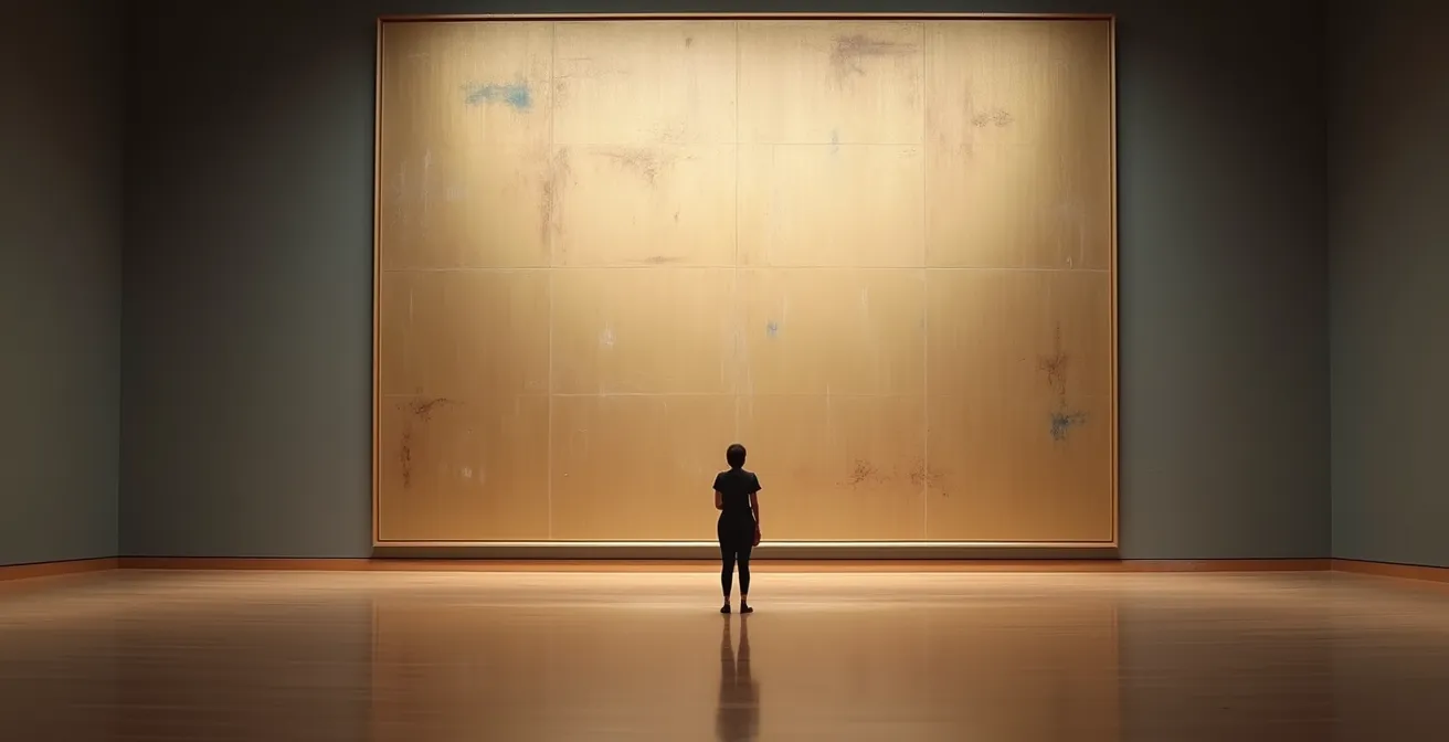
Why Seeing Art in Person Changes Your Brain Chemistry
In our digital age, we see more art than ever before on screens. But seeing a high-resolution JPEG of the Mona Lisa is not the same as seeing the Mona Lisa. The physical presence of an original artwork—its “aura,” as the philosopher Walter Benjamin called it—profoundly changes the viewing experience. This is not just a romantic notion; it is a neurological reality. Reading a painting fully requires experiencing its physical form, because key parts of its visual syntax are lost in reproduction.
One of the most immediate losses is scale. A monumental history painting designed to dwarf the viewer and inspire awe becomes just another 5-inch image on your phone, losing all of its intended emotional impact. The texture of the paint—the thick impasto of a Van Gogh or the smooth, invisible brushwork of an Ingres—is flattened into a uniform digital surface. These are not minor details; they are deliberate choices by the artist to convey meaning and emotion. The physical journey the object has taken through time, with its cracks and restorations, is also part of its story.
Recent science confirms this deep difference in engagement. A groundbreaking 2024 gallery study using mobile eye-tracking demonstrated that viewers in a museum exhibit far more complex and sustained viewing patterns than when looking at images on a screen. The physical space and the presence of the original object trigger a deeper level of cognitive and emotional engagement. The study found that an incredible 95% of visual fixations were retained during museum viewing, indicating a much more thorough ‘reading’ of the artwork.
The unique presence of an artwork in time and space is irreplaceable. As Walter Benjamin famously wrote in his essay “The Work of Art in the Age of Mechanical Reproduction,” this is the source of its authority.
The aura of an original artwork comes from its unique existence in time and space—its history, the artist’s touch, its physical journey.
– Walter Benjamin, The Work of Art in the Age of Mechanical Reproduction
Therefore, while digital tools are useful, the final act of reading a painting should, whenever possible, happen in front of the object itself. Only then can you fully appreciate the artist’s command over scale, texture, and physical presence—essential elements of the artwork’s complete narrative.
Painting Time: How to Show Movement on a Static Canvas
How can a static, two-dimensional surface convey the dynamism of a chase, the grace of a dance, or the violence of a battle? Artists have developed a sophisticated toolkit of visual cues to imply motion and the passage of time, tricking our brains into seeing movement where there is none. One of the most powerful of these techniques is the selection of the “pregnant moment.”
This is not the moment before or after the action, but the single instant of peak tension that most strongly implies both the immediate past and the imminent future. By choosing this critical point, the artist loads the static scene with narrative momentum. The viewer’s mind automatically fills in what just happened and what is about to happen next, creating a sense of movement and time.
Case Study: The Pregnant Moment in Bernini’s ‘Apollo and Daphne’
Though a sculpture, Bernini’s masterpiece is one of the clearest examples of this principle. He doesn’t show Apollo chasing Daphne, nor does he show Daphne as a fully-formed laurel tree. Instead, he captures the exact, breathtaking instant of her transformation. We see her fingers sprouting leaves and her leg beginning to be encased in bark, even as her face is still caught in a cry of terror and her body is in full flight. As detailed in analyses of movement in art, this single moment contains the entire story: the chase (past), the divine intervention (present), and the final transformation (future). The static marble feels intensely dynamic because it is filled with this narrative potential.
Beyond the pregnant moment, artists employ other techniques to create a sense of rhythm and flow. Strong diagonal lines in a composition create a sense of instability, falling, or rising, giving scenes a dynamic quality that horizontal or vertical lines lack. The use of contrapposto in figure studies, where a figure’s weight is shifted onto one leg, creates a subtle S-curve in the body that implies the potential for the next movement. Furthermore, techniques like rhythmic repetition of forms can lead the eye across the canvas, creating a visual momentum that mimics the flow of a crowd or the beat of a dance. By learning to spot these compositional strategies, you can begin to see the hidden choreography that makes a static canvas come alive.
Key Takeaways
- An artist’s primary tool is not paint, but the viewer’s attention. They use visual hierarchy to direct your gaze.
- A painting is not bound by a single moment; techniques like continuous narrative allow it to tell a story over time.
- Symbols are not a fixed dictionary; their meaning is created by their context within the artwork’s specific narrative.
Saying “I Love You” with a Fern: Victorian Botanical Codes
Sometimes, the hidden narrative in a painting isn’t told through grand composition or dramatic action, but through a secret, silent language understood only by the initiated. No period demonstrates this better than the Victorian era, with its complex code of floriography, or the “language of flowers.” In a society constrained by strict rules of etiquette, flowers became a means of expressing feelings that could not be spoken aloud. Paintings from this era are often full of these hidden messages, creating a rich sub-narrative for those who know how to read them.
Every flower had a specific meaning: a red rose for passionate love, a yellow rose for jealousy or infidelity, an iris for valor. But the syntax was more complex than a simple one-to-one dictionary. The way a flower was presented could change its meaning entirely. An upright flower affirmed the sentiment, while an inverted one negated it. A bouquet could form a complex sentence, with each bloom a different word in the message. The placement on the body mattered, as did the condition of the petals. A wilting flower could signal the end of an affair or a love unrequited.
Case Study: Hidden Messages in Victorian Family Portraits
A seemingly straightforward Victorian family portrait could, in fact, be a hotbed of unspoken drama. A sprig of forget-me-nots (remembrance) placed near an empty chair could be a poignant tribute to a deceased child. A husband presenting his wife with a bouquet containing yellow roses (infidelity) and oleander (beware) could be a subtle, public accusation. As detailed in guides to understanding art’s hidden languages, a suitor holding a fern (sincerity) and a red camellia (unpretending excellence) was making a very specific and honorable proposal. For the Victorian viewer fluent in this language, the painting told a story far more detailed and intimate than what was visible on the surface.
Floriography is a perfect final example of what it means to “read” a painting. It demonstrates that some narratives are intentionally coded, accessible only through specialized knowledge. It reminds us that every single element in a composition, no matter how small or decorative it may seem, has the potential to be a carrier of meaning. By adopting this mindset of deep-reading, you equip yourself to uncover the layers of story embedded in any work of art.
By learning to see the visual syntax of hierarchy, time, gaze, and symbol, you have moved beyond being a passive spectator. You now possess the tools to actively deconstruct an artist’s narrative choices and read the stories they have so meticulously crafted. The next time you walk into a museum, you will carry not a checklist, but a new literacy.